June 9, 2007: The power of visualization
Topics:A slight format change. Market gyrations (again). A picture worth a 1000 words. Current ETF rankings Next column spoiler
A slight format change
Thanks to those giving me feedback. Even if you think it is unimportant, please send feedback. Here's what I learned: what I write is too long and too infrequent. So as of today the columns becomes shorter (This one is ~760 words excluding lists/charts; which is 3.6 (!) times shorter than the previous) and hopefully a bit more frequent. I'm thinking a column every 3 weeks, instead of every 2 months or so. Please email me about what you would like to see or hear, or if you'd like to get off the list, thanks!Market gyrations (again)
It happens every few months, with some regularity. Markets take a turn south, and everything starts moving down, except the inverted ETFs (those that are short the market, or invested in puts). Even if I pick the least correlated ETFs -- those which look like they are trying to stay away from the herd -- even those, suddenly start moving down, together with the herd.
Sometimes, not always, the precious metals move the opposite way, but as market historians know, investing in Gold has been, on average, a pretty bad idea. After a great Gold rush run, in the past 12 months, Gold is up a measly 6.6%, while the S&P500 is up more than 20%.
I was much more worried around May 10, 2006 when I first saw the "everything turns down" phenomenon in the ETF data I started collecting in February 2006. At least now this has become a familiar pattern.
The fears now are that earnings are slowing down and the markets are over-extended. In Q1, 2007 there were similar fears, expectations for the S&P500 corporate earnings were for about +3% YoY (same quarter, year over year) earnings gains. When earnings came out at about +9% YoY, on average, the markets rallied with great force.
Is this time the same as in the last summer, or last February? Different? Will earnings really be much weaker this time around? I don't know. If I ever know, and I'm working on it, I promise to share. Here's what I do know. The more I look at the raw-data and the more powerful tools I use, the easier it becomes the get insight. I'll provide more evidence for that in future columns. Which leads me to today's main (and shorter!) theme.
The power of visualization
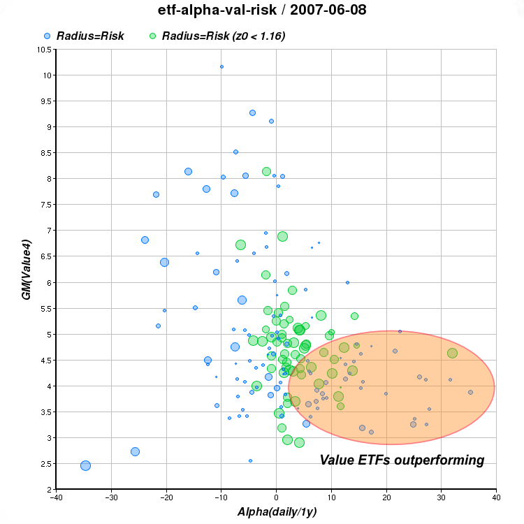
Take a look at this piece of ETF data. Each line represents one ETF and contains 3 points:Assume this data set has a few hundreds rows (we have over 400 ETFs by now, but we ignore some for lack of sufficient historical data.)
- Daily alpha (market independent out-performance) vs. the S&P500 over the past 12 months
- A geometric mean of 4 value metrics (p/e, p/b, p/cf, p/s ratios) and finally:
- Some measure of risk based on volatility and unpredictability (beta and sigma) vs. the S&P500.
	AlphaD	 GMValue Risk
	...
	13.83	 4.2934  1.1291
	 3.91    5.1225  1.1306
	-0.83	 4.9438  1.1329
	32.02	 4.6334  1.1360
	10.16	 4.2447  1.1384
	12.29	 4.7403  1.1387
	 8.07	 5.3634  1.1421
	-2.59	 4.8569  1.1426
	-6.51	 6.7249  1.1428
	-4.14	 4.8775  1.1481
	 4.21	 5.0715  1.1493
	 2.03	 2.9636  1.1506
	 5.27	 4.7843  1.1518
	 5.10	 4.7260  1.1525
	 1.30	 4.2323  1.1600
	 3.89	 3.5602  1.1620
	-7.36	 4.4344  1.1641

	...
	[a few hundred more points omitted]
It is hard to make sense of it. It is certainly very hard to get any feel of what's "going on" in the markets based on this seemingly random data. Add more data and it becomes even more incomprehensible.
But convert the data to a chart and suddenly things become so much clearer. Human eyes in combination with the human brain can grasp patterns amazingly well. This is what we realize when we say that a picture is worth a thousand words, or when we can "recognize" a smiling clown in the complex shape of a cloud overhead; all in the blink of an eye.
In this case we map the 1st two numeric columns to the X, and Y axes and the 3rd column to the radius of the circle. We also paint circles where the 3rd column is smaller than 1.16, green instead of blue and invert the ratio so smaller ratios produce bigger green circles to emphasize circles that are "less risky."
[ETF interactive chart, requires JavaScript]
Perhaps the most significant pattern that emerges from this chart, is this:
Almost all the circles that are significantly on the right half of the chart (i.e. ETFs that have outperformed the S&P500 independently of market direction) happen to be in the bottom half of the chart (i.e. they are value ETFs).
And by making this very obvious observation, we've just (I hope) convinced ourselves that current markets have a strong preference for value over growth. This partly explains why our current strategy has been weighting value as an important factor in picking ETFs. Things, of course can always change, but then we hope that our charts and models will change too.
Current ETF rankings
[Note very dated material]
Here are last Friday's rankings (top 40 ETFs):Using mmvr ranking method on 20070608 1 3.2041 EWY iShares MSCI South Korea Index 2 3.0879 TTH Telecom HOLDRs 3 2.9750 EWG iShares MSCI Germany Index 4 2.9378 VAW Vanguard Materials VIPERs 5 2.8411 RPV Rydex S&P 500 Pure Value 6 2.8109 RFV Rydex S&P Midcap 400 Pure Value 7 2.7839 ADRU BLDRS Europe 100 ADR Index 8 2.6697 ADRD BLDRS Developed Markets 100 ADR Index 9 2.6010 PXE PowerShares Dynamic Energy Exploration 10 2.5668 PRFE PowerShares FTSE RAFI Energy 11 2.5603 FEZ streetTRACKS Dow Jones Euro STOXX 50 12 2.5599 PKB PowerShares Dynamic Building & Construction 13 2.5432 PWP PowerShares Dynamic Mid Cap Value 14 2.5391 VOX Vanguard Telecom Services VIPERs 15 2.4942 XLE Energy Select Sector SPDR 16 2.4860 EZU iShares MSCI EMU Index 17 2.4670 IEO iShares Dow Jones US Oil & Gas Ex Index 18 2.4668 IXP iShares S&P Global Telecommunications 19 2.4028 RZV Rydex S&P Smallcap 600 Pure Value 20 2.3693 IYZ iShares Dow Jones US Telecom 21 2.3653 PRF PowerShares FTSE RAFI US 1000 22 2.3186 PWV PowerShares Dynamic Large Cap Value 23 2.3101 EFV iShares MSCI EAFE Value Index 24 2.3025 EWQ iShares MSCI France Index 25 2.2989 EWN iShares MSCI Netherlands Index 26 2.2964 IEV iShares S&P Europe 350 Index 27 2.2957 DIA DIAMONDS Trust, Series 1 28 2.2840 VTV Vanguard Value VIPERs 29 2.2795 VDE Vanguard Energy VIPERs 30 2.2513 DBN WisdomTree Intl Basic Materials 31 2.2291 EWC iShares MSCI Canada Index 32 2.2262 IHF iShares Dow Jones US Healthcare Provider 33 2.2252 RYE Rydex S&P EqWght Energy 34 2.2186 PPA PowerShares Aerospace & Defense 35 2.2098 DKA WisdomTree Intl Energy 36 2.2021 VGK Vanguard European Stock VIPERs 37 2.1944 JKF iShares Morningstar Large Value Index 38 2.1806 EWP iShares MSCI Spain Index 39 2.1795 ELV streetTRACKS DJ Wilshire Large Cap Value 40 2.1755 EWK iShares MSCI Belgium Index
Next column spo^H^H^Hteaser
In the next column we'll see how can we visualize a market strategy. Stay tuned.-- ariel