Nov 17, 2007: Life, the universe, momentum, & reversion to the mean
Highlights:Markets Overview Quantifying Momentum Current ETF rankings
Markets Overview
Just as September and October were extreme in their upside, November has, so far, been extreme in its downside. The S&P500 ETF, SPY, is down 5.73% so far in November. The highest momentum country ETF, FXI (iShares FTSE/Xinhua China 25 Index) is down 18.37% month to date - it is still up 105.21% in the past full year. Gloom, doom, and recession talk are everywhere. The ^VIX (CBOE Implied Volatility Index) has spiked over 30 in November. There's almost full consensus that this is it, and we are in the beginning stages of a bear market.The (very few) dissenting contrarian voices are repeating the usual arguments:
and most importantly:
- Bear markets don't start with a bang
- Bear markets don't start when everyone is so gloomy
- The Fed will make sure that the credit crunch doesn't spin out of control
- Financial firms big write-offs and CEO heads rolling are (well, mostly) yesterday's news
- Corporates are not nearly as leveraged as they were in the past. Balance sheets are strong.
Of course, earnings can shrink dramatically once consumers close their wallets and hunker down in their bunkers. Holiday sales might be very weak, further dragging earnings, investor sentiment, & the markets down. The US might drag the rest of the world down, etc.
- Valuations are still reasonable in many assets. (China and some other hot-market pockets are the exception), and
- Earnings-yields are still comfortably above risk-free interest rates.
My take is simple: even if this is a bear market, there will be assets that will do well in it. If so, our algorithm should find these assets and zero in on them given some time. As an example: the dividend-weighted WisdomTree International Utilities (DBU) -- now ranked 5th by our time-tested MMVR algorithm (Moderate momentum, Value, Risk) -- is up 1.45% in November. A similar ETF: JXI (iShares S&P Global Utilities) which is ranked 8th, is down only 0.1% in November, while being up 14.85% since July. These are defensive assets which should do well during a bear market while paying some small dividend. In general: infrastructure plays like utilities, tend to do well in bear markets and provide dividends together with a low correlation to the stock market. Also note that the markets continue to be large-cap biased, don't fall in the trap of trying to dip into small-caps just yet.
Now on to the numbers and the deeper insights.
Quantifying Momentum
Momentum, like its definition in physics, is the tendency of an object to keep moving at its present (constant) speed. Unless some force is applied on the object, the object will keep moving along its current trajectory. This concept can be applied to financial assets as well. As long as there's no new bad news, such as a downward revision in earnings growth, or conversely, some positive upward surprise, the asset will keep on going roughly in the same direction.Since financial assets don't move in straight lines, like classical physical objects, we need a different way to quantify momentum.
The way this is done is simple. We break the returns of an asset into time periods, e.g. percent change per month, and then compare the return of one month to that of the next. Of course, we do it on multiple periods (e.g. many months). If there's a positive correlation between the returns and our sample is representative, we can say that "momentum exists".
More accurately, we use what is called auto-correlation: the correlation of a series of returns vs itself, shifted in time. We can do it on daily returns, or weekly, monthly, or yearly. Even better, we can do it on all of the above.
For example, let's start with a long series of daily returns on the S&P500 ETF (SPY) from the past 15 years, starting in February 1993 till October 2007. It is a long series of numbers, over 3700 numbers. Some are positive (SPY went up on that day), and some negative (SPY went down). The question is: "does one day (or week, or month, etc.) has any predictive power on the next in the series?" To answer the question we shift the vector by one position and run a linear correlation of the vector against itself. We then repeat the same experiment for pairs of days (periods of 2-day returns), 3-days, 4-days, and so on, up to 252 trading days which is a full year worth of trading. The result is the following chart.
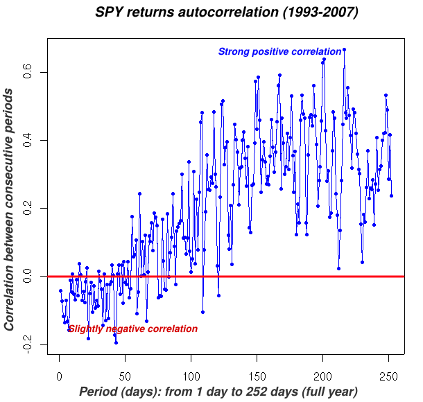
A few points observable in this 15 year history of the SPY:
- When looking at short periods, the correlation is (very slightly) negative. In other words: if the SPY is up today, it is (a tiny bit) more probable it'll go down tomorrow than up. This is also true for periods up to about 40 trading days (slightly less than 2 months)
Periods of 50 days and longer, very rarely have negative auto-correlations. As the periods become longer the positive auto-correlation of successive periods becomes stronger. The auto-correlation peaks between 150 and 200 days. For example: an up 6 months period (about 126 trading days), is more likely to be followed by another 6-month up period than not.
- The chart is extremely non-monotonic. There are often very large jumps between one point to the next. This is due to some extreme daily movements. For example a (rare) one day correction of 5% in the SPY is likely to erase gains of many previous periods which happen to include it. These sharp spikes and troughs can be seen as sudden deviations from the mean and they are very common.
- Very sharp deviations from the chart tend to be followed by similarly sharp movements in the opposite direction. For example corrections during bull markets tend to be followed by roughly equally sharp rebounds which put the containing period back in line with its neighbors. Extreme deviations from the mean tend to reverse as quickly as they occurred
- Generally speaking, the longer the inspected period, the bigger the overall range of its auto-correlation. This is due to both:
- Dispersion over time.
- There are less longer periods than shorter periods in the whole 15-year span. This means the far right correlation points are calculated from much smaller and thus more noisy/random samples.
- This chart includes both up and down markets, the last (and the first) long period in a bull market, is followed (preceded) by an uncorrelated period of the prior (following) bear market. In other words, when considering bull markets, this chart actually understates momentum over long periods.
Disclaimer: this particular chart is just one example.
I've looked at many others, and found that each chart is a bit different but the general upward S shape tends to repeat for broad indexes. Auto-correlation charts like the above differ depending on volatility of the underlying. The more volatile an ETF is, the less auto-correlated its chart is. Also shorter covered periods tend to show less momentum and lower auto-correlations overall.
My conclusions from looking at many of these charts are:
- The number of points above 0.0 is higher than the number of points below zero for many broad ETF I looked at at multi-year time ranges. IOW: at least for broad indexes, and for long-term time frames, one may claim that "momentum exists."
- Perhaps more importantly: short term extreme and sudden dips or spikes in momentum, which reflect extreme overbought or oversold conditions, tend to (quickly) revert to the mean. Since these dips are very common, and since the vertical distances between many neighboring points are much bigger than the respective mean slope of the chart, it seems that exploiting the reversion to the mean effect holds even more promise than exploiting the 'global' momentum itself.
Current ETF rankings
In this Friday's ETF rankings, the dominant themes are: Large-cap, Energy, Utilities (a newcomer), Telecoms, Materials, and a strong preference of international ETFs over domestic ones.
Top 40 out of over 500 ETFs
Using mmvr ranking method on 20071116
1        2.6722 EWG     iShares MSCI Germany Index
2        2.4419 ADRU    BLDRS Europe 100 ADR Index
3        2.4219 EWY     iShares MSCI South Korea Index
4        2.3636 GML     SPDR S&P Emerging Latin America
5        2.2931 DBU     WisdomTree Intl Utilities
6        2.2891 IXP     iShares S&P Global Telecommunications
7        2.1747 EWP     iShares MSCI Spain Index
8        2.1564 JXI     iShares S&P Global Utilities
9        2.0729 DKA     WisdomTree Intl Energy
10       2.0577 DBN     WisdomTree Intl Basic Materials
11       2.0276 XOP     SPDR Oil & Gas Exploration & Production
12       2.0141 DGG     WisdomTree Intl Communications
13       2.0137 FEZ     streetTRACKS Dow Jones Euro STOXX 50
14       1.9278 ADRD    BLDRS Developed Markets 100 ADR Index
15       1.9199 MXI     iShares S&P Global Materials
16       1.9193 PXE     PowerShares Dynamic Energy Exploration
17       1.8764 RYE     Rydex S&P EqWght Energy
18       1.8683 IEO     iShares Dow Jones US Oil & Gas Ex Index
19       1.8596 VWO     Vanguard Emerging Markets Stock VIPERs
20       1.7839 GMM     SPDR S&P Emerging Markets
21       1.7545 DNH     WisdomTree Pacific ex-Japan Hi-Yld Eq
22       1.7397 KXI     iShares S&P Global Consumer Staples
23       1.6885 IXC     iShares S&P Global Energy Sector
24       1.6826 EZU     iShares MSCI EMU Index
25       1.6590 DWM     WisdomTree DIEFA
26       1.6548 DOL     WisdomTree Intl LargeCap Dividend
27       1.6547 EZA     iShares MSCI South Africa Index
28       1.6474 DND     WisdomTree Pacific ex-Japan Total Dividend
29       1.6439 EWC     iShares MSCI Canada Index
30       1.6325 UTH     Utilities HOLDRs
31       1.5732 GMF     SPDR S&P Emerging Asia Pacific
32       1.5663 EPP     iShares MSCI Pacific ex-Japan
33       1.5588 SLX     Market Vectors Steel
34       1.5498 EWM     iShares MSCI Malaysia Index
35       1.5031 PUA     PowerShares Dynamic Asia Pacific
36       1.5029 DOO     WisdomTree Intl Dividend Top 100
37       1.4955 EVX     Market Vectors Environmental Services
38       1.4948 DEM     WisdomTree Emerging Markets Dividend
39       1.4927 GDX     Market Vectors Gold Miners
40       1.4913 ITA     iShares Dow Jones US Aerospace & Defense
One caveat on the above: ADRU and ADRD are not having up-to-date valuation metrics, this might overstate their value after pretty nice run-ups in recent years. I would avoid them because of that.
As I explained above, my favorite ETF right now is DBU. Korea and Germany, Energy, Materials, One Latin American country (Brazil) and Telecoms (especially Global), remain in my portfolio for now.
That's about it for this November. I hope to write again in December.
As always, any feedback, question, request, criticism etc. is very welcome.
-- ariel