March 1, 2008: Fun with heat-maps
Highlights:Market update A safe haven in commodities? Heat-maps: a strong 3D data visualization tool (with 3 examples)
Introduction
In this article we're back in the analytical seat.
A heat-map chart
(see below)For those who are not into machine learning, there's a brief description of the 3 ways through which machine learned models can be improved. Then, a new data visualization tool, the heat-map, is introduced.
Colorful heat-maps can convey some powerful stories which are much more convincing than a set of 50,000 numeric data points in 3 dimensions. This can lead us to the critical insights from which better investment models can be conceived and built.
And they are beautiful too.
Market Update
Last week, a few economic reports made the markets catch cold again. As expected, US GDP in the last quarter of 2007 was flat, and jobless claims spiked up; both adding a bit more weight to the theory we're into a possible recession. In addition, some new doubts about the Ambac bail-out arose, and few are ready to buy municipal bonds despite the great rates and assurances offered.
To top it all, American International Group, Inc. (AIG), the world largest insurer, dropped its own subprime bomb when they announced a loss of $5.3 billion dollars (the biggest in their history) as a result of having to write off $9.2 billion of subprime related investments.
Note that nothing of the above is really new, it is just more of the same, but the markets still seem very nervous. This brings memories of 2001-2002 when one company after another revealed that yes it too was, after all, inflating earnings, leading to high profile bankruptcies like those of MCI WorldCom (among the top 5 NASDAQ stocks in market-cap during the bubble) and eventually, Enron (no 7 in market-cap at its peak, on the S&P500).
The AIG loss has made it obvious to those who didn't know already, that insurers who bought subprime financial instruments (aka ISVs, or CDOs), are (surprise!) exposed to the subprime mess too. AIG should serve as a case study because of several reasons:
- Trust: just 3 months ago, in early December, 2007, AIG said in a presentation to investors that its exposure to the mortgage sector was "manageable," and predicted solid earnings growth of 10% to 12% annually over the next five years. In other news, the responsible unit chief is now gone. This is typical, we saw it repeat in Citigroup, and Merrill, and others. Blame it on the fall guy, and hope that investors would trust you from now on.
- Missing closure: Chief Executive, Martin Sullivan said that the subprime crisis had thrown AIG into "uncharted waters" and that the turmoil would likely continue through 2008 (translation: we can't really promise anything going forward). AIG did not rule out further write-downs and losses, but said the crisis that led to the fourth-quarter loss was "not expected to be material in the long run". Reassuring words, not!
- How much is priced in? AIG shares tumbled 6.9% on the news. They dropped more the day before the announcement, making it obvious that this wasn't a surprise for some supposedly cynical investors. And AIG is down over 30% since October which means the market, as always, has seen this coming.
Investors focused on technical analysis, were quick to notice that stock prices which were forming a "pendant" (narrowing sideways triangle) suddenly broke the pendant pattern to the downside. This was a signal for many to sell everything they could. Stocks are still above the January 22-23 lows. The fear is that if that low breaks, another down leg in the broad markets looks probable. It also makes it probable that not all skeletons in the financial sector have been uncovered, and since companies can't be trusted, more pain in financials is to be expected. Will they finally bottom in the spring? We'll have to wait and see.
A safe haven in commodities?
When markets are very narrow, meaning only a small subset of stocks shows strength, it is instructive to look at that small subset.The one sector of the market that has been showing tremendous resilience is anything to do with actual "stuff", i.e. commodities. This includes oil, metals and materials in general, precious metals like gold and silver in particular, and agricultural commodities: wheat, sugar, soy-beans, cocoa, coffee, etc.
Indeed, there's only one long ETF in the November suggested portfolio, that kept going up up and away in January, DBA: agricultural commodities. It is the only ETF of that defensive bunch (excluding the short ETFs) which I would keep on holding today, due to its continuing strength. No wonder food prices are up ~20% in the past year. Also there's no doubt that the core consumer price index (CPI) which strips out the "volatile food and energy prices" cannot be trusted as a representative of real consumer prices.
Here is a chart of the top 9 ETFs by recent 10-week Omega (a measure of recent risk-adjusted strength) vs SPY (the S&P500 ETF).
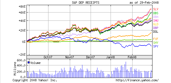
The ETFs in the chart, from top performing (past 10 weeks) down, are:
- SLV iShares Silver Trust
- DBS PowerShares DB Silver
- DBA PowerShares DB Agriculture
- IAU iShares COMEX Gold Trust
- GLD streetTRACKS Gold Shares
- DBP PowerShares DB Precious Metals
- DGL PowerShares DB Gold
- FXF CurrencyShares Swiss Franc Trust
- SHY iShares Lehman 1-3 Year Treasury Bond
- SPY SPDRs S&P500 (added for reference only)
The fear of inflation is high so it seems good too have some exposure to commodities in a portfolio, not just because they are strong, but also because they are typically uncorrelated with stocks and are seen as a hedge against rising prices.
I would advise, however, to enter these only when they are short-term oversold. Now they look extremely overbought, so I would be careful. Also, once the markets become strong again, they may start underperforming, so be on watch.
Another approach: There are a few country ETFs which are strongly associated with commodities; among them: Brazil, Chile, Canada, Russia, and Australia. Not surprisingly, all these have been outperforming the S&P500 in the past 6 months. Australia with its sky-high interest rates has been the weakest, while Brazil, Russia, and Canada have been the strongest of the bunch. Of these top 3, Brazil is the strongest. It the only one which is, remarkably, back up near the October highs after losing close to 20% in the October-January down-leg. This is a country which is independent on Oil (Brazilian cars run mostly on E-85), had a big recent Oil discovery near its shores, and is the country running the biggest trade surplus vs. China. One warning: the Brazil ETF (EWZ) is very volatile. A country ETF like EWZ, may be a good (diversified) play on commodities, but I would buy it only on dips.
Another option is Chile (a relatively new ETF: ECH) which has been strengthening in the most recent 3 months and is the best play on copper. Copper is a commodity of great practical value as an electric conductor that is now in great demand. Think of the new Chinese middle class, buying houses and electronics, all of which need large amounts of copper-based wiring. Copper production remains limited and strained. Update: there's some fear that Chile's power system is strained beyond capacity right now. Once emerging markets as a whole broaden and stabilize, VWO (Vanguard World) would be my favorite. Wait for a clear bottom (several months, higher highs, and higher lows) first.
Heat-maps: a strong visualization tool
Back in early 2006, I came up with the idea of using interactive bubble-charts to represent ETFs in various dimensions. We've seen bubble-charts providing insights into valuations, earnings-growth, correlations, momentum and more.
ETF bubble charts are great for representing a few hundred points (ETFs) in up to 3 dimensions, but less useful when we need to represent more dimensions, a much larger number of data points, or ETF independent, mostly continuous data.
In classical machine learning practice, results can be improved through one of 3 ways:On top of these one can use meta-learning techniques: semi-supervised, active learning, co-training (one model learns from another) and so on. Finally, automating processes of incremental learning can get results faster.
- Better Data: more data points, making sure the data is clean and correct. Automating data collection for efficiency, etc.
- Better Features: What's the best target feature? Is it plain return? Perhaps risk adjusted return is better? What known data points (or combinations thereof) are better predictors of the target feature, and are independent of each other? Should we use A and B separately, of the ratio of their logarithms? Should we normalize our features before plugging them into the model?
- Better Models: A model translates known input features, into the unknown (unlabeled) target features. There are many models and algorithms one can pick from. The question is which model would be the best (most accurate and consistent) predictor for future data. We can use linear-regressions, model-trees, support-vector machines, maximum-entropy models, bayesian models, boosted trees, genetic-algorithms, neural nets, "expert committee" ensembles which combine many of the above, etc. Different models and approaches can greatly differ in their accuracy depending on the problem domain and many other factors.
I've always been looking for better ways to visualize data where the data has thousands, or even millions of points. Naturally, visualization can help all 3 of the machine learning steps:
- data inspection/verification
- feature selection, and
- strategy/model selection
In my quest for picking the most promising input variables and strategies affecting investing results, I've spent many hours of CPU time running experiments last month. A central idea was to let the computer churn all night in order to produce one clear picture worth a thousand words in the morning. To that end I wrote some code to convert ordinal data in 3 dimensions into a heat-map.
A heat-map is a 3-dimensional (X,Y,Z) chart, where the Z axis is represented by a color. A "cool" color like dark purple is mapped to the minimum value and a "hot" color like bright red, to the maximum value. In between the red and purple lie all the visible spectrum (rainbow) basic colors. When you map your target feature to the heat/color dimension, and your input variables to the (X, Y) axes, you can make tens of thousands of points tell an immediate, convincing, and clear story.A few examples follow.
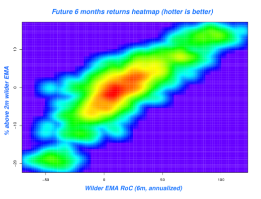
Example #1: long-term vs short-term momentum effect on future returns
We already know that "momentum", or current relative strength, is an important feature which is positively correlated with future returns. We also know that buying an asset that is "overbought" is not a good idea because an ETF that has risen too fast in the recent short term, is bound to revert to its own mean. The question is, of course, are there some optimal values for these two features? The following heat-map representing about 50,000 data points from both bull and bear markets shows that there's a sweet spot giving the best future 6-month return. You want to buy momentum, but not when it gets too strong to be sustainable. This particular chart is a 'sum' of all points rather than their averages so it represents the market as a whole rather than trying to figure the best point in the grid. IOW: there are more points in the center of the chart than in the periphery.
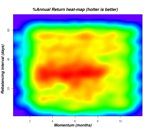
Example #2: grid-search: momentum and rebalancing interval
Another example is a grid search on two dimensions looking for the best performing combination of:Again, this heat-map was produced from a large number of points (thousands) which were themselves produced from tens of thousands of ETF price data points. There's a gaussian-blur effect added, a common technique used to smooth-out noise and reveal the signal behind the noise. Although this chart, unlike the previous, does represent average Z values (rather than sums) in each grid-point, you should still ignore the peripheral area which is low due to lack of data.
- Momentum measured by 3 to 10 months (Wilder) moving averages
- Rebalancing interval in days: how frequently to switch the portfolio to the highest momentum ETFs.
The heat-map makes it clear that, for this particular data-set, there are multiple momentum periods (roughly 3 to 8 months) which work well, while a too long momentum (10 months) is weaker in its future return prediction power. Similarly, it shows that too frequent (chasing short-term momentum too aggressively) and too infrequent rebalancing (failing to get rid of weakening ETFs in time, and cut losses early) can both, hurt performance.
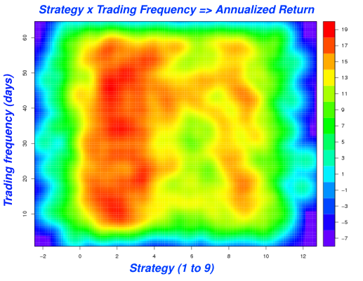
Example #3: another grid-search: strategies and rebalancing interval
In the following example the X-axis is not ordinal, but categorical. I was simply trying to compare a set of 9 different automated strategies (numbered 1 to 9) with respect to their recent 5 year (including the recent Oct-2007 .. Jan-2008 fall) annualized returns. All the strategies tested are 100% long (no shorting), fully invested (no attempt at timing), and use no leverage.Again, this chart uses grid-averages for the color, rather than a sum, and a gaussian blur. What's different? a lower gamma to help distinguish between the shades of red better. It also adds a numeric scale-bar for the color/heat (Z) dimension.
This heat-map makes it obvious that for the same 5-year input data set, simple strategies [4 to 9] which use a "one input feature" rule, produce much lower average annualized returns, than strategies [1 to 3], which take into account both medium term momentum and oversold/overbought conditions. The former produce about 11% to 15% annualized returns, while the latter produce about 4% more: 15%-19%.
The chart also makes it obvious that the stronger strategies are less sensitive to the length of the rebalancing period.
In summary, heat-maps are a powerful tool enabling us to turn a massive number of experimental data points into a compelling and convincing picture. Heat-maps can lead us in the right direction in our quest for more optimal solutions. Finally, heat-maps can be used in all three steps of the machine learning practice:
- Insight into the raw data: outliers, hot-spot detection etc.
- Feature selection via grid search and feature strength comparison
- Model selection and fine-tuning via output-feature response to changes in strategy and model parameters.
Hope you liked the colorful new charts. We'll see more of them in the future as I get closer to a more robust all-season ETF model. As always, any feedback, question, request, criticism, is welcome.-- ariel
